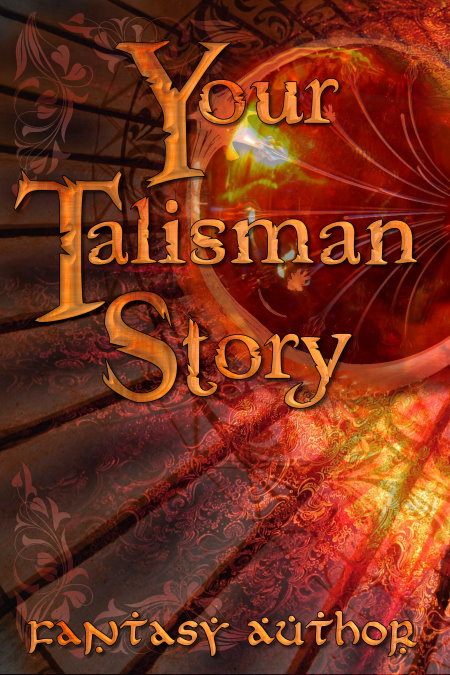
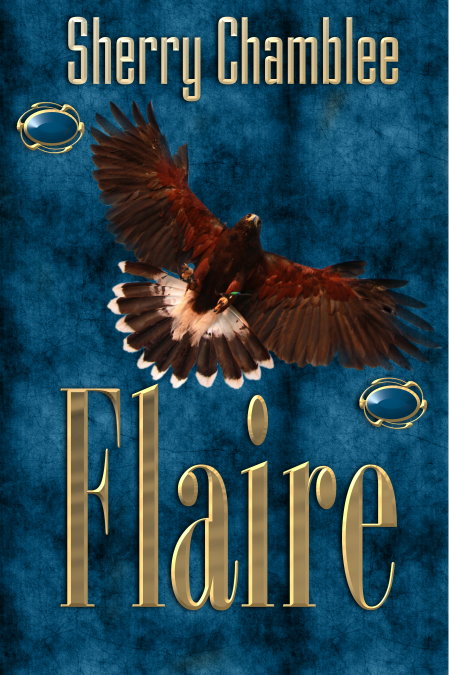
(Pictured above is one example of an ebook cover I made as a sample of my work. It incorporates many of the elements covered in this post. Can you spot the layering, use of vectors, and making the font complement the genre-specifics of the cover?)
This post may get a little involved and technical, but I hope it will help struggling authors who are trying to make their own ebook covers. I posted about print book covers in the previous post, and you can refer to that too. This post will help you even if you are making a print cover first, from scratch. Some authors pay a designer to make the ebook version and then create the print book cover themselves. Either way you do it, these two posts together will hopefully give you some help.
I will say that there are many photo manipulation programs, from costly to free in price and from relatively simple to difficult in use. I won’t say any are easy, and I will say that there can be a big learning curve because of all the features and variations some programs have. The different interfaces can be easier or harder to cope with.
I use PhotoImpact, formerly made by Ulead, now sold by Corel, and have for many years. It is comparatively inexpensive and can be purchased here: http://www.paintshoppro.com/en/products/photoimpact/ I had a Photoshop Lite version before that, and I think the features are in many ways similar. Both are feature-rich, meaning they have many tools and many options for designing, tweaking, and creating. I also know that even experienced professional designers mostly only use a fraction of the features a program has available. Familiar tools that do the job become old friends. Trying new things can be time-consuming and difficult. The last thing a designer wants to do is spend tons of time on a single cover, particularly if he is also a writer responsible for producing the story that fits that cover.
I don’t know what program people will choose to use so I am going to try to make my references to tools, menus, etc., within the program as generic as I can. As I said, my reference is PhotoImpact so bear with me if not everything specifically applies to, or is easy to find an equivalent of, in your program. My purpose is not to teach photo manipulation. That takes a long time to learn to do well. I just hope to be able to make it possible for some people to expand their do-it-your-selfer skills.
Determine the size of your final book. We make ours 5.5 x 8.5, a standard size for paperback books. Many people prefer 6 x 9. If you say, this will only be an ebook, why does it matter what size it is? I reply that you may wind up making a paperback someday. Formatting your manuscript for a print size is not a waste of time. There are details of print formatting that don’t apply to ebooks but if you set your ebook up with appropriate margins, page breaks, and proper beginning and ending chapter formatting you will have an easier time if you later want to make a print book. It will also look more professional to readers who grew up with “real” books.

This is a 5.5 x 8.5 cover, or, 1650 x 2550. If it is not showing full size in the post you should be able to click on this or any other image to get a full-size version. The image at the top of the post is a 6 x 9 or 1800 x 2700
If your cover is for a 5.5 x 8.5 book, create a blank file that is 1650 x 2550 pixels, 300 DPI. If it is 6 x 9, make it 1800 x 2700. Always make the image resolution 300 DPI. That’s a required resolution for print. Again, think of the future, and the possibility that it might be used for print someday. 72 DPI is all you need for screen resolution, and it will make a smaller file size, but your image will appear clearer and sharper, even in smaller sizes, if it’s 300 DPI, and therefore be more attractive to potential readers. What is DPI, you ask? It means dots per inch and refers, simply put, to the level of realistic detail in an image, which in digital form is just a bunch of dots, or pixels. The more pixels crammed into an inch of space in an image, the clearer and sharper and better it looks.
The image size is in part determined by the requirements of the ebook upload sites. Last time I checked, iTunes, or, in this case, iBooks, sets the standard for minimum dimensions of a book cover. It doesn’t have to be either of the sizes I suggested above, but it has to be at least 1400 on the smallest size and 2500 on the longest size. Dimensions are typically given with the width first and the height second. (1400 x 2500, in this case) And they are given in pixels, not in inches. The dimensions I gave above are larger than those minimums, which will keep you in good shape on major ebook retailers for upload.
[Now for the bad news. PhotoImpact was designed many years ago and seems to have become an orphan as far as updates are concerned. There have been a few but it is a bit slow and clunky with these large file sizes, especially when doing the much larger print layouts. You will have to be patient through the slow wait times for it to catch up with your process, especially if you place a large amount of text and then try to change and move it around.]
You now have a blank image of the correct size and resolution. Time to fill it with a wonderful book cover. First you must determine the genre of your book. The most important thing a cover does is attract readers. But it must attract the readers that really want the book you wrote. If you put a kissy-face couple on there, or a rose and a string of pearls, or a heart, or anything that looks romantic, it had better be a romance. If you put a sailing ship on a stormy sea with a crew struggling to keep from wrecking, it had better be some type of historical adventure. I can’t tell you the exact cover that’s right for your book. I can say it needs to send a clear signal about the subject, immediately, to people who might see it 1/16th of full size (or smaller) for one second. It must at least say STOP AND LOOK CLOSER! before the potential reader just says “Meh …” and moves on. I can give detailed instructions all day long about how to put an attractive cover together but I cannot make the point too strongly that you have got to nail your genre or few people will give it a glance. Genre is a category or subject into which your book fits. Maybe you will say, “My book is nonfiction. That’s not a clear genre.” But it still has a subject. Bible Study. Cooking. Home Repairs. Overcoming Depression. Whatever it is, keep looking until you find the perfect image that stands up and screams, “THIS BOOK IS ABOUT WHAT YOU WANT TO READ ABOUT!”

Try to guess the genre of this cover in the comments below.
So you may ask, “Where do I look for images?” That depends in part on what you want to pay. There are stock photo sites that charge a lot of money for what are sometimes excellent images. Two examples are iStock and Getty. You can pay $20 or more just for one image. Some sites charge $5 or at least under $10 per image. CanStock is a good one, and so is Fotolia. There are many others, and, if you plan to make a number of covers, you can get a subscription or a package, paying so much for a certain number of images at discounted prices versus single images. You may not want to pay for images. That is your choice. Many photographers and even “photoshoppers” offer free images on sites like Pixabay. That is one of my favorite free image sites. But remember the quality of images, especially free ones, varies considerably. You will probably have to look at hundreds before you find an excellent one, paid or free. In the next section I’ll give some suggestions on why you want to keep looking.
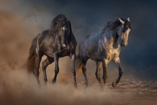
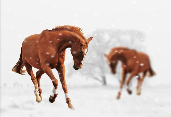
(First imageis from Depositphotos. Second is Public Domain from Pixabay.)
Why use a paid versus free image? It depends on what you need, want, and can afford. The first image above is a free one. It’s very nice as pictures of horses go, but the second on, which is paid, shows the exact two horses I needed as a promo for two young adult historical books I had written. That’s why I paid for it, to get just what I wanted, and also because of the surrounding finishing touches — the lighting and cloudy shapes. I also have been able to twice purchase a highly-discounted image pack from Depositphotos. Look hard for deals if you want a lot of great images.
You need an image, whatever it is, to have certain qualities. These include clarity, simplicity, lighting, and composition. There are other things, but these are the basics. If you are tempted to use a homegrown images, such as your son’s picture of your dog, it had better be professional quality in size and resolution. Don’t use grainy or blurry or too small pictures unless you are going for a specific artistic effect and can truly pull it off and convince people you didn’t just thoughtlessly put a crummy picture on your book cover. The same goes for handmade art. If your cover needs refrigerator art, okay, but don’t use unprofessional art just because it has some personal significance to you. It has to attract readers. Use the largest size you can get. Stretching it often makes it distorted.
I am more and more convinced that all book covers attract more readers if they make proper use of light. Thomas Kinkade attracted millions by being the “painter of light.” Find a way to incorporate light into your cover. Find an image that has excellent light to start with and you don’t have to manipulate anything. Even if it’s a creepy thriller, incorporate a haunting, eerie light. If it’s inspirational, use a candle or oil lamp or glow of sunlight or moonlight. Light attracts attention. Find a way to use that to your advantage. Learn the different light-enhancing techniques of your program. Don’t just stick in a spotlight or bolt of lightning. The idea is to make it glow invitingly.


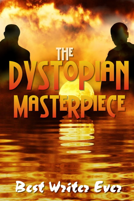
Examples of the use of lighting to get your cover some attention, no matter the genre.
A note about using a single image as your cover: I discourage it for several reasons. Some stock sites include in their very lengthy and complicated terms that you should not re-use a complete single image in something you mean to sell. Some specify that you must substantially change an image to avoid copyright issues. Even if you “buy” an image from a stock site, you don’t really own it. There are restrictions on how you use it and how many times you can reproduce it and all sorts of limits. You are responsible to use that image in a responsible manner. It contains digital information that is kind of like a GPS. They can find and track it. So, what you need to do is follow their terms of use, and, also, incorporate two or three images in a cover to be on the safe side.
People, animals, genre-specific objects, and backgrounds are the usual image components of a cover. I don’t recommend putting more than about three images together into a cover. It becomes cluttered and you lose control of the ability to make them all appear to blend and belong.


Examples of using people on covers. The first includes a “free” image. use such images with caution. The second includes silhouettes, which can be free and there is no need to worry about model releases because no one is recognizable. You can also use free images that show the back or lower parts of individuals. Anything that does not show a face is fair game if the image itself is pubic domain. The third cover is a composite of two paintings. These are great options for historicals, and allows for including people without incurring the need for model releases. As long as the painting is more than 100 years old, and the photographer just took an unaltered image of it, his photo can’t be copyrighted and the image is public domain.
A few special notes about including people on a cover. Even if you use images labeled “Public Domain,” if they include people, you should try to ensure that there is a model release. That means the person or persons gave permission for commercial use. If there isn’t one, you could be sued by that person. Some images are labeled “editorial use only.” That means you can use them on a blog or for educational purposes but you can’t use such images on something you mean to sell. Some models also specify that they don’t want their images used in any way that they or other people might object to. That can be a broad objection that’s hard to answer, say, if they object to the image on a Christian book cover because they are atheists. It’s up to the cover artist to walk the fine line of compliance when using people. Rules are even stricter for copyrighted images, logos, or things that are very famous. Be careful about images you use. Get permission, when in doubt.
If you choose to make a cover with no people, you can make a very striking cover just out of text, which I’ll deal with momentarily. You can use inanimate objects like fruit, weathered wood, or seashells. Doing this makes clarity, lighting, and simplicity all the more critical. You can use animals, landscapes, or interesting room settings. The possibilities are almost endless. Just choose the best of the best and remember the keys of clarity, simplicity, and lighting.

Some examples of covers with no people. Can you guess the genres in the comments?
Don’t crowd or clutter the cover with all the elements or subjects in your book, unless your book is about crowding and clutter. One author wanted me to put a host of characters from his book on the cover. At least seven, I think. Can you imagine how impractical that would be? If it’s an ensemble cast, you still should focus on the leader, or maybe the two or three most important characters. Remember the first impression people get of the cover is probably going to be tiny on a search page. If a reader sees nothing but blobs of color he may not stop to figure out what it is. I’m going to expose myself to some extent here, and talk about a very early cover I made for my first Benny and the Bank Robber book (the most recent version is pictured below the next section of text.) This is an example of how NOT to do a cover more than anything.
Quickly going through some of the no-nos I have learned since doing that cover: “Floating heads” are mostly bad. I had a whopping FIVE of them, which makes it five times as bad. I painted a fake hat on one character and boy did it look fake. The Bible and the cougar (oops — SIX floating heads) make seven images, plus the forest background … and the attempt at painting texture looks … amateurish. The only good thing about it was that the text was fairly readable. Don’t let this happen to you.
So, whatever elements you have chosen, it’s time to see if they work together on your cover. This is called compositing. Each object you add to a cover goes on its own layer. You can move them up and down the “stack” and around on the “page” at will with tools like “send backward” or “bring to front” or “center horizontally.” You can also resize, flip, or rotate. (Just watch out for any lettering, such as on a T-shirt) that might end up displaying backwards.)
This is not an art or design course, so I can’t go into a lot more dos and don’ts. But here are a few. Do match up shadows and lighting. Imagine where the main light source is in the composition and make sure all the elements fit with that lighting. If they don’t, find something that does. There are people irritated enough by shadows falling the wrong way to reject your book. However great the story is, you’ve got to convince them to pick it up. Your cover’s got to impress them, not make them say, “Hey, the guy has a shadow on the left side of his face but the girl’s is on the right. that looks weird.” or “That woman is so faded she looks like a ghost next to that bright, colorful guy.” Somehow you have to make the elements match. This is where learning to use your brightness and contrast settings can help. Play with them and if you can’t get them right, consider another image. Match quality, intensity, light and shadow, and everything you can.
Use the tools you have, such as erasers, faders, feathering, and other types of edge-softeners, to get rid of unwanted backgrounds in the images you put together. Be especially careful with hair and spaces between fingers, elbows and waists, and other spots that could stand out and make the final image look amateurish. Match the edges of the images to the background if at all possible — dark on dark, light on light.
Watch tutorials on techniques. Strive to improve. Magnify until you can see tiny details. Add shadows and directional lighting if you can. Play with the direction objects are facing and something might just click into place in your mind to improve the overall look. My best advice when it comes to placing objects for a cover is that you may not be able to realistically match, say, people to a scenery background, without some tricks. You’ve no doubt seen people that look pasted onto a background. You might not be sure what’s wrong, but it’s just clear they don’t belong in that scene. Sometimes a light mist or smoke or fog can really help blend a scene.

Do the elements “match” among these images? Why or why not?
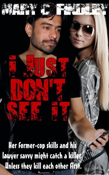
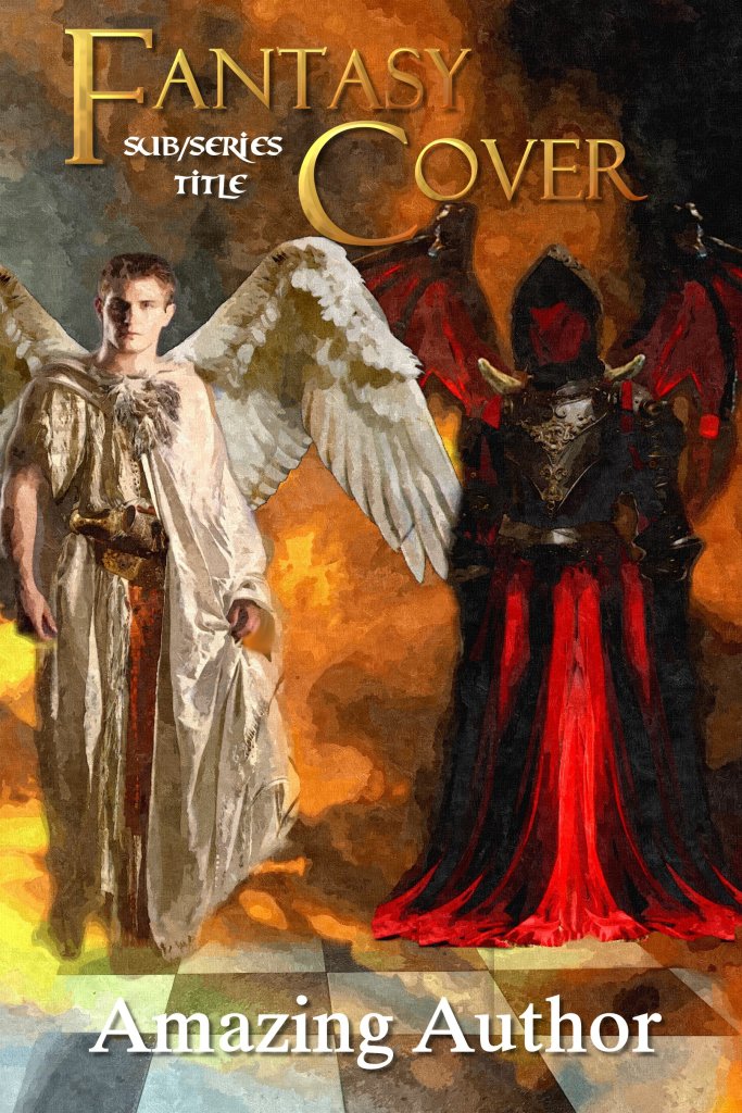
The three images above represent different phases of my cover design career. The first, entitled “I Just Don’t See It,” was made quite a few years ago and includes so-called “free” people images. In fact, the man has two different images composited. His head did not come with his body. That’s why I included it, to see if I hid it well enough. I probably wouldn’t use it at this phase of my career, both due to the permission issues with the people, and the fact that I am not convinced my compositing skills are that good. The middle image is an attempt at a “painted” fantasy cover requested by an author friend. He didn’t think it was what he wanted but I did sell it to another author who thought it was perfect for her. I composited a whole bunch of photographic components in this image, especially on the demon figure. Again, it was made a few years ago, and my skills and image choices have improved, I think, since then, so I would do it differently now. Still, I was pleased with the results of my experiments on the whole. The third image was made very recently and consists of three images — the sunlit forest background. the boy with the suitcase, and a cloudy mist layered over the top. Simple but effective, I believe.
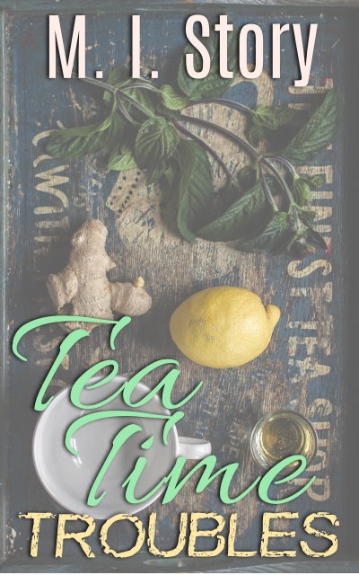
I could go on for pages about compositing but this is supposed to be a brief explanation. So, to help blend images, try the light screen overtop idea. I have used that with success more than once. It can be as simple as a picture of mist or sunlit rays made transparent and laid over the image. One thing you can do is just set the images on a textured background like a collage, as in the “Tea Time Trouble” cover above. Don’t try to make them fit together. Just include them, perhaps fading or shadowing, and present it as a sort of shadowbox or scrapbook page. Those can turn out quite well. Divide the cover into sections and include separating elements or make them framed by the title to aid the composition.


As you go along creating your final cover image, don’t forget that you need text. Author and title at a minimum, and possibly a tagline or subtitle. Those should, if possible, not cover your images, or, at least, not important parts of them. Text placement can be great fun and should harmonize with the rest of your design.

This example of a cartoon-style cover uses multiple images, which were relatively easy to composite because these art-style images are usually vectors or .png files, which means they often don’t have a fixed background and can be resized any way you like. They look a bit like Colorforms and can be set in place without worrying as much about blending in. As long as you choose artwork of similar styles, hopefully by the same artist, you can do exciting things.
The capitals text on this cover is a free font, in a series called Kingsthings. This font designer makes charming, detailed fonts and offers them for free. I made the capitals larger, aligned them within the chain of the heart locket, and tucked everything together in a technique called “nesting.” Try not to get too many different fonts going on a single cover. Remember, we are concentrating on simple. I used the same font on the subtitle and the author name.
Mix up ornate fonts with simpler ones, straight with curly. Try different sizes, such as tall at the beginning and end of a title to create a sort of mirror effect. By the way, be very careful about getting free fonts. Font sites are common sources of viruses. Stick with a few reputable sites, like 1001 Free Fonts, Dafont, and FontSquirrel. Check carefully because not all the fonts on these sites are free. Some are pay, some are donation, some are other arrangements with the creator. One font creator asked that if I use his font I send him a copy of what I did with it.
I have hundreds of fonts, including a package from MyFonts that I downloaded for $20 with many classic fonts. If you can use 10 fonts out of a package like that it is worth buying, because fonts often cost $20 or more just for one set of one good design. Beware of free fonts that are missing punctuation or other elements. You can sometimes substitute from a complementary font and still get a good result. Some font packages also include “dings,” which are shapes that can be very useful. You can pretty up a title treatment with dings, vector objects, and even small images, as on the series covers below, the second cover being for a book I am currently working on. In the first, the Baron’s Ring is incorporated into the B in the title, and in the second, the “T” is formed by the sword. Swirly vectors add some flourish to the text. The similarity of the placement of the images and text styles and ornaments tie the series together. People can see at a glance that these two books go together.


When your cover is completed, (and please, save and make backups all along the way) save it as a project (In PhotoImpact that is a UFO format. In Photoshop it is a PSD. There are many options to save but those are two to help you keep projects straight.) This is critical if you need to come back and make changes later. The other file format, the one you will later upload to ebook publishers, is either a jpg or a png. The png format is a larger file size, but better quality. Also insert your ebook cover into your text file at the front. Many sites require this and remember, if you ever change your cover, you have to upload a new version of the text with the updated cover included, too.
Just for fun, I will close with a book I have yet to write, but I had a lot of fun designing the cover. It’s inspired by a character in Treasure Island. Look for the ideas I’ve discussed in this post: making the genre clear (hint: remember that humor is also a genre), making the images fit together or at least complement each other, text treatments, and anything else you notice. Please comment with your observations. Also, let me know what I missed in this post. Remember, I want to help.

Though making excellent covers is not easy, it can be enjoyable. Don’t try to get too complicated as you learn. Remember clarity, simplicity, and lighting.
